
One Dashboard, Four Tools, Zero Tabs: The New Creator Studio
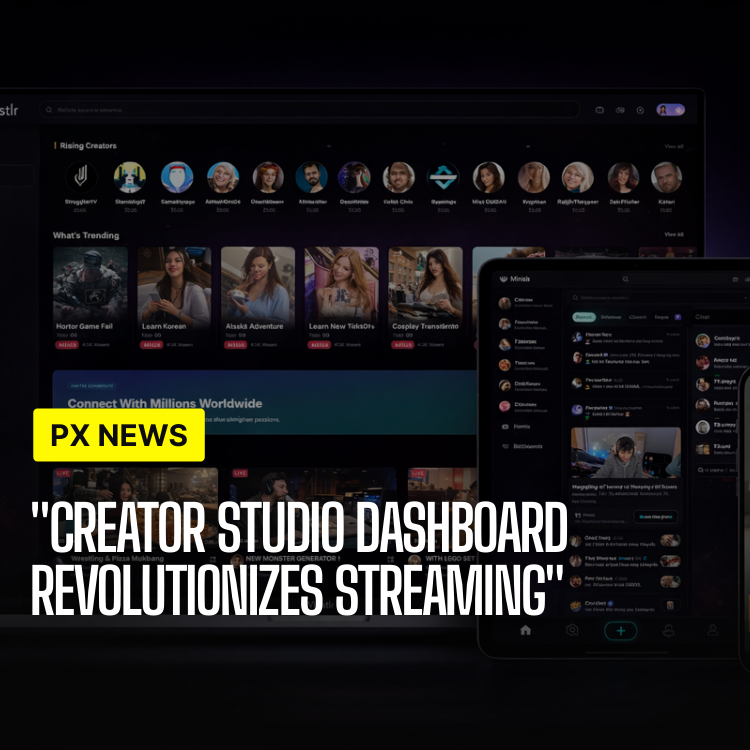
Before this release, running a serious presence on Whistlr meant checking four different places to answer one simple question: how is this actually going? The new Creator Studio Dashboard puts all four in one screen.
Analytics lived in one place. Scheduling lived in another. Audience data was scattered across profile insights and follower breakdowns. Monetization — tips, subscriptions, payouts — sat in its own settings area entirely. None of it was broken exactly, but none of it talked to the others either, which meant creators trying to understand their own performance were doing the cross-referencing manually, in their heads, every single time.
The Creator Studio Dashboard is Whistlr's answer to that gap — a single command-center view built specifically for creators who treat their account as something closer to a small business than a hobby, without asking every casual poster to learn a more complicated interface they don't need.
The Problem With Four Tabs
The team's research going into this release was blunt about the issue. In interviews with active creators, a recurring theme was what the team started calling "tab fatigue" — not any single feature being bad, but the mental overhead of stitching together a picture of your own account from four disconnected sources before you could make one decision, like whether to post now or wait, or which content type to lean into next week.
One creator interview stuck with the team enough to shape the brief directly: a mid-sized lifestyle creator described spending close to twenty minutes most mornings just checking numbers across different screens before deciding what to post that day — time spent entirely on gathering information, not on creating anything at all.
That twenty-minute routine became something close to a design constraint. The team's working target for the new dashboard was to compress that same morning check-in to under three minutes, without hiding any of the underlying data — just organizing it around the decisions creators were actually trying to make, instead of around the four separate systems that happened to generate it.
Analytics That Actually Answer Questions
The dashboard's analytics section was rebuilt around decisions rather than raw numbers. Instead of a wall of charts, it leads with a small set of answers to the questions creators actually ask: what worked this week, what didn't, and why. Post-level performance is broken down by format — video, image, text — so a creator can see at a glance whether their video posts are meaningfully outperforming everything else, rather than digging through individual post stats one at a time.
Retention curves for video content now render inline instead of requiring a separate export, showing exactly where viewers tend to drop off within a post. For creators making longer-form video, that single view has already reshaped how some early-access users are editing — trimming intros that used to run fifteen seconds down to five once they could see, directly, how many viewers didn't make it past the old ones.
A comparison view was also added specifically for creators running similar content formats repeatedly — a weekly recap series, a recurring segment, a regular collaboration slot. Instead of reviewing each post's numbers in isolation, the dashboard can line up recent entries in the same series side by side, making it far easier to notice a slow decline or a sudden spike than it would be scrolling through a chronological post list one at a time.
Content Scheduling, Built Around Real Workflows
Scheduling moved from a simple calendar to something closer to a planning surface. Creators can draft posts across Minis, Chattr, and Circuts from the same composer, queue them against a visual calendar, and see suggested posting windows based on when their specific audience has historically been most active — not a generic best-practices time slot, but one calculated from that account's own engagement history.
Draft posts sync across devices automatically, so a caption started on a phone during a commute can be finished and scheduled from the iPad or desktop app later without starting over. Bulk scheduling was also added for creators managing content batches — uploading a week's worth of Minis at once and spacing them out automatically rather than scheduling each one individually by hand.
For creators who collaborate with a small team — an editor, a manager, someone handling captions — the dashboard now supports limited delegated access, so a second person can queue drafts into the calendar without holding full account credentials. It is a narrow permission model rather than a full multi-user system, but it covers the most common request the team heard from creators who had started outgrowing a strictly solo workflow.
Audience Insights Without the Vanity Metrics
The audience section deliberately avoids leading with follower count, which the team considers the least useful number on the page for actually growing an account. Instead, it surfaces audience composition — active time windows, top locations, growth sources broken down by which feed or feature actually brought someone in, and a repeat-viewer rate that tracks how much of a creator's audience is returning versus new each week.
That last metric came directly out of creator feedback during the beta. Follower count can grow while an audience is quietly disengaging underneath it, and several beta creators specifically asked for a way to see that happening before it showed up as a slow decline in overall performance weeks later, once it was harder to trace back to a cause.
Growth-source attribution also got more specific in this release. Rather than a single generic "discovery" bucket, the dashboard now breaks new followers down by the exact surface that brought them in — a Chattr post, a Minis video, a live stream, a shared profile link — which gives creators a much clearer read on which format is actually converting viewers into followers, rather than just which format gets the most views in isolation.
Monetization Tools in the Same View
Tips, subscriptions, and payout tracking now live inside the same dashboard rather than a separate settings menu, shown alongside the content and audience data that explains them. A creator can see a spike in tips on a specific post next to that post's performance data, instead of trying to mentally correlate two separate screens days apart from memory.
The dashboard also adds a simple monthly projection based on recent trends — not a guarantee, but a rough estimate creators can use for planning, calculated from the last 90 days of activity rather than a single unusually strong or weak week that might not represent a typical month going forward.
Payout history, previously buried a few screens deep in account settings, now surfaces directly on the dashboard's monetization tab with a clear breakdown by source — tips, subscriptions, and brand partnership payments where applicable. Creators managing taxes or working with a manager or accountant can export a clean summary for a given date range instead of manually assembling one from separate transaction logs.
One beta tester, who runs a mid-sized cooking-focused account, described the monetization view as the single change that mattered most to her day-to-day routine — not because the underlying numbers changed, but because she could finally see which specific recipes drove tips without cross-referencing three separate exports by hand at the end of every week.
"Creators don't want more data. They want fewer places to look for it. That was the entire design brief for this dashboard, and we said no to a lot of feature requests that would have violated it."
Malik Devon, Head of Creator Products
At a glance, the dashboard now covers:
- Performance overview — post-level analytics broken down by content format, with inline retention curves for video.
- Smart scheduling — a cross-feed composer and calendar with audience-specific suggested posting windows.
- Audience insights — composition, active hours, growth sources, and repeat-viewer rate, without leading with follower count.
- Monetization summary — tips, subscriptions, and payouts shown alongside the content performance driving them.
- Monthly projections — a rolling 90-day estimate for planning, clearly labeled as an estimate rather than a guarantee.
- Delegated access — limited permissions for editors or managers to queue scheduled drafts without full account credentials.
Rolling Out to Creator Accounts
The Creator Studio Dashboard is available now to all verified creator accounts, with a simplified version rolling out to standard accounts that post regularly, even without full creator status. The team built it to scale down gracefully — someone posting occasionally sees a lighter version of the same dashboard rather than an empty one built for a level of activity they haven't reached yet.
Accessing it requires no new setup for existing creator accounts — the dashboard replaces the previous analytics screen directly, using the same underlying data that was already being collected, just organized differently. Historical performance data carries over automatically, so creators checking the new dashboard for the first time see their full history rather than starting from a blank slate.
This is the first version of a dashboard the team expects to keep building on, particularly as more monetization tools ship throughout the year. The goal, as the team puts it internally, is for Creator Studio to eventually be the only screen a serious creator needs to open before deciding what to do next — and this release is the first real step toward that being true rather than aspirational.
Feedback from the current rollout is already shaping what comes next, including requests for deeper collaboration features and more granular export options for creators running their account alongside outside brand deals. None of that is locked in yet, but the underlying architecture — one connected view instead of four separate systems — is built to absorb those additions without creators losing the single-screen simplicity that was the entire point of this release in the first place.