
How We Rebuilt Whistlr for the Big Screen
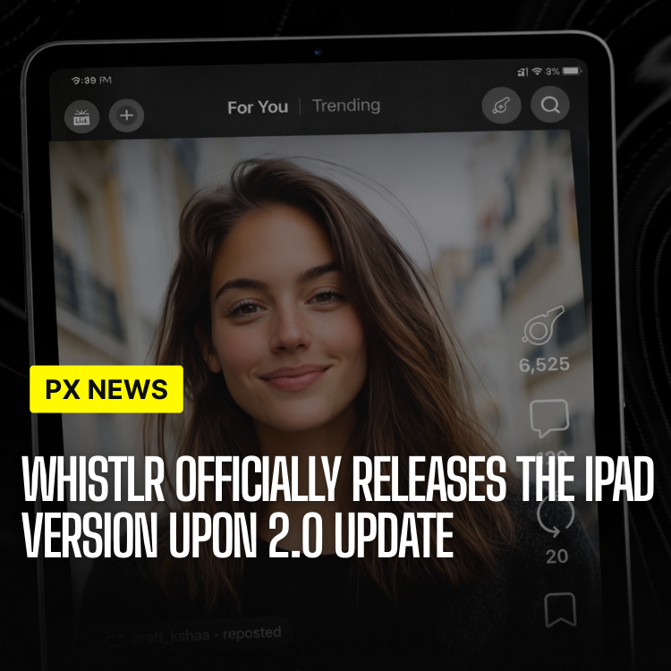
Whistlr's iPad app is not a stretched-out version of the iPhone app. It was rebuilt screen by screen for a form factor most social apps still treat as an afterthought, and it launches today.
For years, opening Whistlr on an iPad meant opening the iPhone app at 2x scale — larger buttons, more empty space, and none of the multitasking behavior iPad owners actually expect from their other apps. That gap is exactly what the native iPad app was built to close, and it marks the first time Whistlr has designed a layout from scratch for a screen this size rather than adapting an existing one.
Requests for a proper iPad app had been sitting near the top of the mobile team's feedback backlog for well over a year before work started in earnest — a persistent, specific ask from a segment of users who reached for an iPad specifically during longer sessions: catching up on a feed at the end of the day, editing a longer post, or watching a live stream while doing something else at the same time. Those are exactly the sessions a stretched phone layout serves worst.
Why a Native iPad App, and Why Now
The case for an iPad app was never really in question internally — the debate was about timing. Building a genuinely native experience meant waiting until the new navigation architecture behind Whistlr 2.0 was stable enough to support a second, structurally different layout without doubling the maintenance burden on every future feature the team ships.
Once that foundation was in place, the iPad app became less about scaling up existing screens and more about asking a different question for each one: what does this feature look like when a user has three times the screen space and, more often than not, a keyboard nearby? A comment thread that made sense as a full-screen modal on an iPhone often works better as a persistent side panel on an iPad. A creator's analytics view that had to be scrolled through in pieces on a phone can sit fully visible on one iPad screen at once.
That question ended up reshaping more screens than the team originally scoped. What started as a project focused on the feed and the video editor eventually touched messaging, notifications, and search as well, once early prototypes made it obvious how much space those screens were leaving empty on a full-sized iPad display compared to how tightly they had to be packed on a phone.
Split-Screen Multitasking, Done Properly
The headline feature is full support for iPadOS split-screen multitasking — Whistlr can now run alongside another app in Slide Over or Split View without losing state, restarting video playback, or dropping a draft. That sounds like a small thing until it is the thing standing between a creator finishing a caption and giving up on it halfway through.
A few scenarios the team specifically tested and tuned for:
- Watching and messaging at once — keep a live stream or a Minis video playing in one pane while replying to messages in the other, with playback continuing uninterrupted.
- Research while posting — pull up Safari or Notes next to the composer when writing a longer Chattr post or thread, without Whistlr losing your draft in the background.
- Reference while editing — keep a reference photo or video open in Photos while trimming and captioning a new post inside Whistlr's editor.
- Drag and drop between apps — drag an image or video directly from Photos, Files, or Safari into a Whistlr post composer instead of exporting and re-importing it manually.
None of that works if an app pauses or reloads every time it loses focus, which is what happens when a phone-sized app is simply stretched onto a tablet screen instead of built to support real multitasking. Getting this right meant rewriting how Whistlr manages background state — the app now holds onto video buffers, draft posts, and scroll position even when it is not the active pane, instead of treating a loss of focus as equivalent to being closed entirely.
Window sizing was another detail that took longer than expected to get right. Split View on iPad can hand an app anywhere from roughly a third of the screen to nearly all of it, and the layout has to hold up at every one of those widths without feeling cramped at the narrow end or sparse at the wide end. Whistlr's iPad interface uses adaptive breakpoints that reflow entire screens — not just resize them — as the available width changes, so a feed narrowed to Slide Over width switches to a single-column layout automatically instead of shrinking a two-column one until it becomes unreadable.
Creator Tools Built for a Bigger Canvas
The iPad app also ships enhanced versions of Whistlr's creator tools, taking advantage of both the extra screen space and, on supported models, the Apple Pencil.
"On a phone, editing is something you do in the cracks of your day. On an iPad, people actually sit down and work. We designed the creator tools around that difference instead of pretending it doesn't exist."
Jordan Blake, Head of Mobile Engineering
In practice, that means the video editor gets a full timeline view instead of a compressed strip, with multi-track audio mixing that is difficult to use accurately on a six-inch screen. The analytics dashboard renders as a true multi-panel layout on iPad, showing audience graphs, top posts, and earnings side by side instead of stacked in a scrolling list the way it appears on a phone. And for markup, captions, and quick sketches over video thumbnails, Apple Pencil support brings pressure-sensitive drawing directly into the post composer.
Multi-clip review is new to iPad specifically. Creators uploading several takes of the same post can now lay clips side by side, compare them directly, and pick a final cut without switching back and forth between separate preview screens — a workflow that never made sense to attempt on a phone-sized display and simply did not exist in the app before this release.
What Changed Under the Hood
Supporting a tablet properly required more than a bigger layout. The team rebuilt Whistlr's image and video pipeline to decode and cache media at resolutions appropriate to a larger display, rather than serving the same assets used on phones and upscaling them — a shortcut that would have made every photo and thumbnail look visibly softer on an iPad's larger, sharper panel.
Keyboard and trackpad support went in at the same time, since a meaningful share of iPad users pair a Magic Keyboard or a third-party trackpad with their device. Whistlr on iPad now supports standard keyboard shortcuts for navigation, posting, and search, along with full trackpad gesture support for scrolling and selection — closer to how a desktop app behaves than how a phone app typically does.
The mobile team tested across the full current iPad lineup rather than optimizing for the newest model alone, since a large share of the install base for the app's existing iPhone version runs on hardware that is one or two years old at any given time. That meant tuning performance and layout on a baseline iPad, not just the Pro line, to make sure the native experience felt native everywhere it shipped rather than only on the device sitting on an engineer's desk.
Available Today
The native iPad app is available now as a free update through the App Store for any iPad running a recent version of iPadOS. Existing Whistlr accounts carry over automatically — there is no separate sign-up or migration step, and content posted from iPad appears identically across iPhone, Android, and web.
This is the first release built specifically for iPad, not the last. The same multitasking and layout work that shipped today is the foundation the team plans to extend toward Stage Manager support and external display output in future updates, as more of Whistlr's creator tools get designed with larger screens in mind from the start rather than added on afterward.
For a platform that started as a phone-first app, treating the tablet as a genuine second surface — rather than a slightly larger phone — is a small shift in how the team thinks about the product. It is also a preview of the same logic behind the desktop app already on the roadmap: build for how a device actually gets used, not just for the screen size it happens to have.